Why Pixel Perfect is important?
Icons are all about clarity and communication. Blurry icons can’t communicate as good as sharp ones. Simple as that. Imagine if road signs were blurry, what a mess they would make!
When you’re working with bigger icons (>64px), blurry edges usually look unaesthetic, and if you need to use them on a smaller scale (16px - 32px) they might be even unrecognizable. And you will never know how your client will use these icons in the future. So pixel perfect is the way to go!
Every Icon Designer should know how to create pixel perfect icons. At some time in the future these skills might become less important as the resolutions on our devices are becoming higher. However, for now it is an absolute must, or a super power for every icon designer out there!
At the beginning of my career as an iconographer, I was struggling with making my icons pixel perfect. Sometimes it was a fail after a fail, but now, with all the experience behind my back, I can proudly say that my icons are sharp as hell! I learned the importance of pixel perfect design the hard way, but it was totally worth it.
Now I feel the need to share this experience. Let me show you my way of making pixel perfect icons.
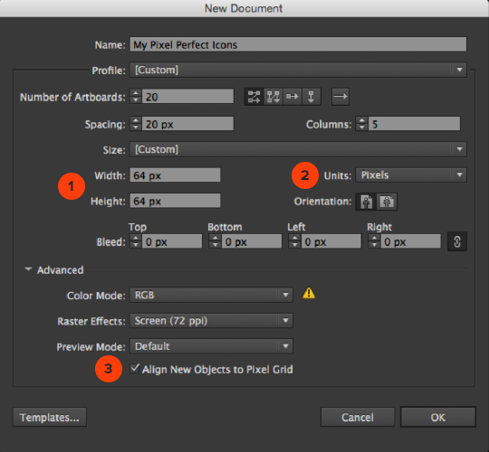
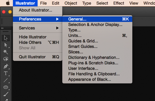
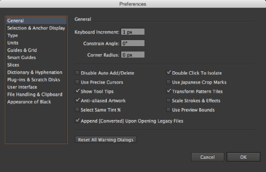
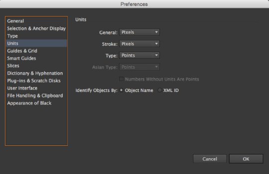
|